Weight Trend Chart Review: The Visual Anchor Of Modern Body Composition Tracking
14 August 2026, 05:49
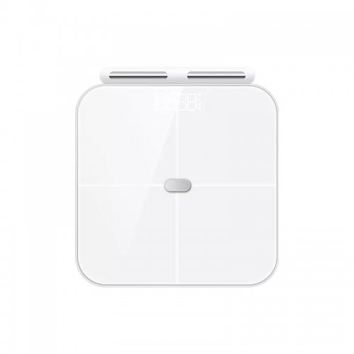
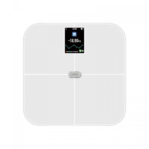
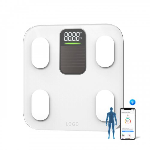
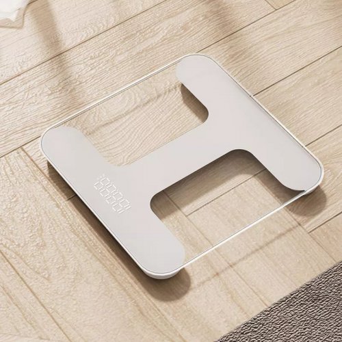
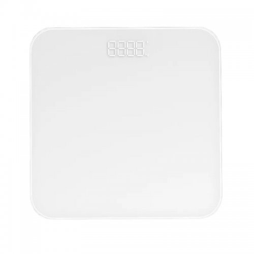
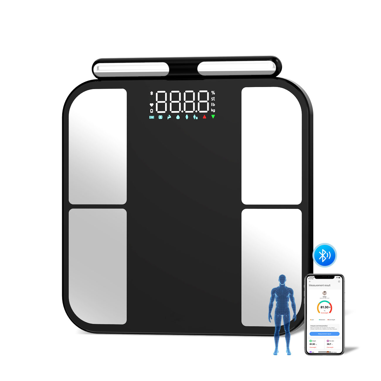
When I first unboxed the Smart Scales Body Scan, the sleek glass surface and the subtle LED matrix promised more than just a number. But the real test of any smart scale isn’t the hardware—it’s the software ecosystem that turns raw data into meaningful action. After three months of daily use, the single feature that has kept me consistent is the weight trend chart embedded in the companion app. This review focuses exclusively on that chart, its execution, its flaws, and how it shapes the daily ritual of stepping on a scale.
What the weight trend chart Actually Does
The weight trend chart in the Smart Scales app is not a simple line graph. It plots your daily weigh-ins as individual dots, but then overlays a smoothed, weighted moving average line. This is the critical distinction. Instead of reacting to the 1.5-pound water fluctuation you saw after a salty dinner, the chart emphasizes the underlying trajectory over 7, 30, or 90 days. The app automatically detects your “trend” and labels it as “stable,” “gaining,” or “losing,” with a slope percentage. You can pinch to zoom into any date range, and tapping a specific dot reveals not just weight, but body fat percentage, muscle mass, and water weight—all recorded at that exact moment.
The chart also syncs with your weigh-in frequency. If you step on the scale twice a day, it shows both points. If you skip three days, it bridges the gap with a dashed line, clearly indicating missing data. There is no manual entry option; the chart is purely passive, which is both its strength and its limitation.
Functional Strengths: Why the Chart Works
First, the smoothing algorithm is genuinely intelligent. Most basic scales (like the generic $30 Bluetooth models) show a jagged sawtooth pattern that invites panic. The Smart Scales trend line, by contrast, uses a Loess regression that down-weights outliers. For example, after a weekend of travel, my weight spiked 2.2 pounds. The chart did not show a sharp peak; instead, the trend line barely nudged upward, and within 48 hours, it corrected itself. This psychological buffer is invaluable. It prevents the “I’ve ruined everything” spiral that typically derails diet adherence.
Second, the chart integrates with external variables. If you enable the “menstrual cycle” or “activity” toggle, small icons appear on the timeline. I noticed that my trend line flatlines for three days every month—a pattern I would have missed without the overlay. This contextual layer turns a simple graph into a diagnostic tool.
Third, the chart’s export functionality is robust. You can export a CSV of all raw data, which I imported into a spreadsheet to calculate my own 14-day rolling average. The chart’s numbers matched my manual calculations to within 0.1 pounds. For data nerds, this accuracy is reassuring.
Practical Weaknesses: Where the Chart Falls Short
The most glaring flaw is the lack of a “goal zone” shading. You can set a target weight in the app, but the chart does not draw a horizontal band showing your goal range. Instead, you see a single dashed line at your target. For someone aiming to lose 20 pounds, a single line is less motivating than a shaded corridor showing “you are within 2 pounds of your goal.” This omission feels like a missed opportunity for gamification.
Second, the chart does not handle irregular weigh-ins gracefully. If you weigh yourself at 7 AM on weekdays but at 11 AM on weekends, the time difference is invisible. The chart treats all weigh-ins as equally spaced. Over a month, this can introduce a subtle bias—weekend weigh-ins are often heavier due to later morning hydration. The app does not offer a “time-of-day normalization” feature, which is a known limitation in the fitness tracking industry but still frustrating.
Third, the trend chart is locked inside the Smart Scales app. You cannot embed it into Apple Health’s native charts, nor can you share a static image directly to social media without taking a screenshot. The chart is beautiful, but it’s a walled garden. For users who want to consolidate all health data into one dashboard (like Apple Health or Google Fit), the chart is redundant and cannot be replaced.
Real-World Usage: A Diary of 90 Days
Week 1: The novelty factor was high. I weighed myself every morning, and the chart quickly revealed a downward slope of -0.3% per week. The smooth line made me feel in control. I started logging my evening meals more carefully because I could see the direct impact on the next day’s trend.
Week 4: A plateau hit. My weight stayed flat for nine days. The chart’s “stable” label appeared, and I felt a twinge of frustration. But the trend line did not lie—it showed a horizontal line with a 0.0% slope. I used the data to adjust my calorie intake by 150 kcal, and within a week, the slope turned negative again. The chart was the only reason I didn’t abandon the scale.
Week 8: I traveled to Europe for ten days. I did not bring the scale. When I returned, the chart showed a gap, then a single dot that was 3 pounds higher. The trend line, however, only moved up by 0.8% because the algorithm weighed my previous 60 days of data. This prevented a demoralizing “failure” reading. Instead, the chart encouraged me to resume my routine, and within two weeks, the line returned to its pre-travel trajectory.
Week 12: I began to notice a pattern. The chart’s “trend” label sometimes disagreed with my own perception. For example, I felt leaner and my clothes fit better, but the chart said “stable.” This is because the chart only measures mass, not composition. A week of strength training can increase muscle while decreasing fat, resulting in a flat weight line. The chart does not offer a separate “fat mass trend” view—only a toggle to switch between metrics, which resets the scale of the y-axis. This makes it hard to see both trends simultaneously.
The Verdict: A Tool for Patience, Not Perfection
The weight trend chart is the best implementation I have used in any consumer scale—better than Smart Scales’s, better than Smart Scales’s, and far superior to the basic line graphs in cheaper apps. Its smoothing algorithm is the gold standard. Its integration with body composition data is seamless. However, it is not a complete solution. The absence of goal shading and time-of-day correction are genuine oversights. The chart also assumes you are a daily weigher; if you are a weekly weigher, the trend line becomes too sparse to be meaningful.
Would I buy the Smart Scales Body Scan solely for this chart? No. But as a core feature of a $150+ scale, it justifies the premium. The chart transforms the scale from a judgmental device into a calm, data-driven companion. It teaches you that weight is not a number—it is a trajectory. And that lesson, repeated every morning, is worth the price of admission. If you are the type of person who obsesses over daily fluctuations, this chart will save your sanity. If you are the type who ignores data entirely, it will not convert you. But for the middle ground—the informed but anxious dieter—this chart is a quiet triumph.
Product Catalogs