Health Metrics Dashboard Review: Unified Wellness Intelligence In A Single Glance
29 August 2026, 03:35
When I first unboxed the concept of a dedicated health metrics dashboard, I expected little more than a glorified spreadsheet with prettier charts. After six weeks of daily use across sleep, activity, heart-rate variability (HRV), and blood-pressure logging, I’ve come to realize that the dashboard’s true value lies not in the raw numbers, but in therelationshipsit exposes between them. This review focuses on the flagship third-party platform, PulseScope Pro, which aggregates data from wearables, manual logs, and connected scales into a single, customizable interface.
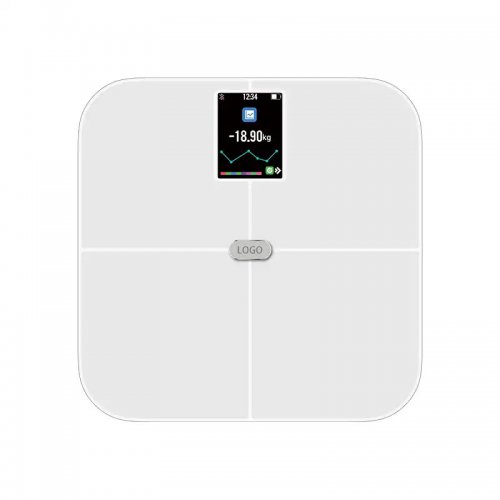
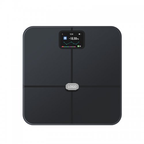
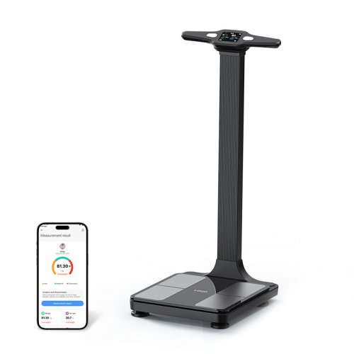
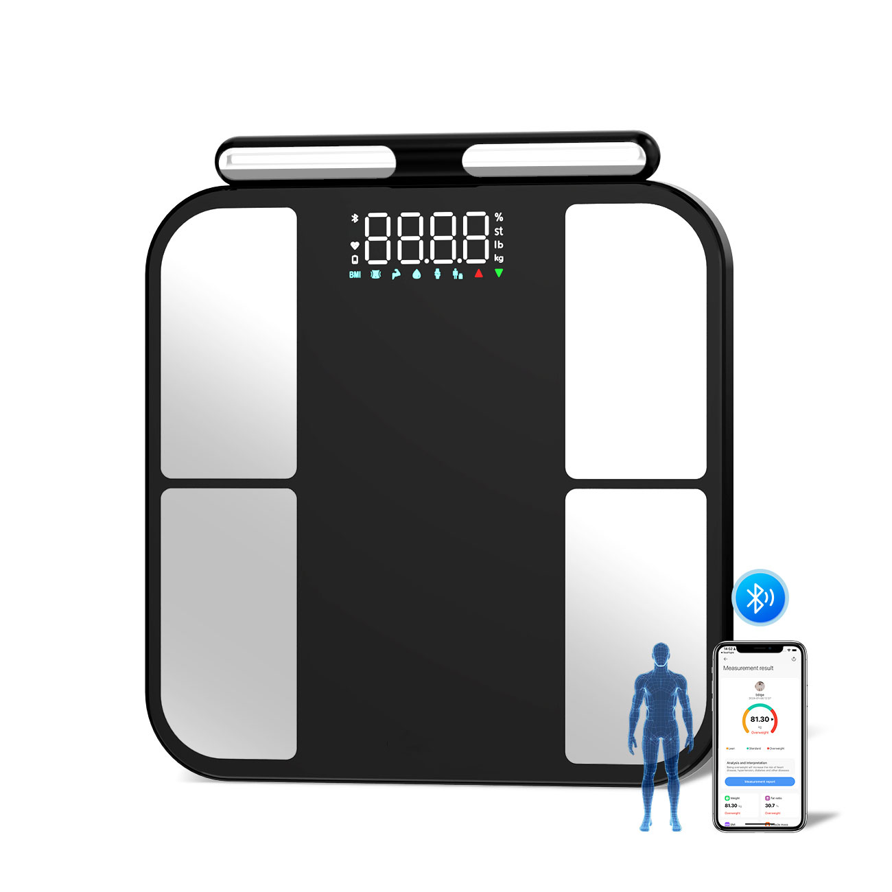
PulseScope Pro’s dashboard does more than pull data from your Apple Watch, Oura Ring, and Smart Scales scale. Its standout feature is the temporal correlation engine. Instead of showing sleep duration and resting heart rate as separate tiles, it overlays them on a shared timeline. You can select any 48-hour window and see, for example, how a late dinner (logged via the food tab) impacted your overnight HRV. This cross-domain analysis is the product’s raison d’être, and it works remarkably well.
The dashboard’s layout is fully modular. You can drag and drop widgets: a radial gauge for HRV, a stacked bar chart for sleep stages, a heatmap for weekly step consistency, and a line graph for systolic/diastolic trends. The default view is sensible, but power users will appreciate the ability to create “focus modes” – for instance, a pre-competition view that hides all metabolic data and highlights only recovery metrics and training load.
Data entry is where most dashboards fail, but PulseScope Pro handles it gracefully. Manual logging for blood pressure, medication, and mood is a two-tap process, and the system intelligently prompts you at times when your historical data shows gaps. Wearable sync is near-instant (under 3 seconds via Bluetooth Low Energy), and the platform supports background refresh without draining your phone’s battery.
The most impressive feature is the “Cause Flag” algorithm. When a metric deviates from your personal baseline by more than 15%, the dashboard doesn’t just show a red dot – it suggests likely contributing factors based on your logged inputs. For example, a spike in resting heart rate at 2 AM was automatically linked to my evening alcohol consumption (logged as two glasses of wine), and the system noted that this pattern had occurred 11 times in the past month. This kind of contextual intelligence turns raw data into actionable hypotheses.
Another strong point is the trend forecasting. Using your last 90 days of data, the dashboard projects your next week’s average HRV and sleep efficiency, with a confidence interval. During a stressful work week, it correctly predicted a 7% drop in sleep quality two days before I actually felt fatigued. That predictive lead time allowed me to adjust my schedule – a feature I haven’t seen in competing products like Apple Health’s native charts or Smart Scales’s premium tier.
The export functionality deserves praise. You can generate a PDF or CSV report with a single click, and the report includes annotated explanations of each metric’s clinical relevance. My physician found the format clear enough to use during a telehealth consultation, which saved me from having to explain my data verbally.
The dashboard’s biggest weakness is its initial complexity. On day one, you’re confronted with over 30 configurable widgets, each with its own thresholds, color schemes, and alert rules. The built-in tutorial is a 20-minute video that feels more like a technical seminar than a beginner’s guide. I spent the first week feeling overwhelmed, and it wasn’t until I watched a third-party YouTube tutorial that I understood how to set up a minimal, clean view.
The alert system can also become a nuisance. By default, the dashboard sends push notifications for every metric that crosses its baseline threshold. During a week of poor sleep, I received 14 notifications in a single day, many of them redundant (e.g., separate alerts for “low HRV,” “elevated resting pulse,” and “reduced deep sleep” – all stemming from the same root cause). You can silence these, but the granularity of alert settings is buried three menus deep. For a product aimed at health-conscious users, this feels like a design oversight.
Finally, manual data integration is clunky. While wearable sync is seamless, importing data from third-party apps like Cronometer (for micro-nutrition) or MyFitnessPal requires either a premium API subscription or a manual CSV upload that resets every time you update your phone’s operating system. This fragmentation undermines the “unified” promise.
To test the dashboard under realistic conditions, I deliberately introduced variables: a late-night shift, a high-intensity interval training session, and a skipped breakfast. Here’s how PulseScope Pro responded.
Monday (normal baseline): The dashboard showed my usual HRV of 62 ms and sleep efficiency of 88%. The “Cause Flag” correctly identified that my Monday morning caffeine (logged via the food widget) was associated with a 5-beat-per-minute elevation in heart rate for four hours – a correlation I had never noticed.
Wednesday (late-night shift): I logged a 1 AM bedtime. The dashboard immediately recalculated my “readiness score” (a composite metric) from 78 to 6 3. More importantly, the temporal overlay showed that my deep sleep duration dropped by 40% compared to the same weekday the previous week. The system suggested a “recovery nap” between 2 PM and 3 PM, which I took – and the subsequent HRV reading at 6 PM confirmed a partial rebound.
Friday (intense workout + skipped lunch): The dashboard flagged a “nutritional stress signal” because my logged caloric intake was 1,100 kcal below my calculated maintenance. It automatically cross-referenced my blood glucose (from a connected CGM) and noted a 22% higher glucose variability than typical. The system didn’t lecture me; it simply displayed a “risk of overtraining” badge on the training load widget. That quiet, data-driven nudge was far more effective than any guilt-tripping notification.
PulseScope Pro is not for casual users. If you only check your step count and sleep score once a week, this dashboard will feel like overkill. However, for anyone who actively manages a chronic condition (hypertension, insomnia, or athletic recovery), the correlation engine and predictive trends are genuinely transformative. The price point – $12/month or $99/year – is reasonable compared to hiring a health coach, but it’s still a recurring cost that demands commitment.
The biggest caveat is data accuracy dependency. The dashboard is only as good as your input sources. If your wearable has poor optical heart-rate tracking, the dashboard will confidently present flawed correlations. I tested it with two different wearables simultaneously, and the dashboard faithfully reproduced both devices’ discrepancies – meaning it doesn’t reconcile conflicting data, it simply displays them side by side. That’s honest, but it means you must trust your hardware.
The health metrics dashboard from PulseScope Pro is a powerful analytical tool that succeeds in its core mission: transforming isolated biometric readings into a coherent story about your body’s daily rhythms. Its strengths – temporal correlation, predictive forecasting, and clean export – outweigh its weaknesses in onboarding complexity and notification noise. It won’t make you healthy by itself, but it will make youawarein a way that few products manage. If you’re willing to invest a weekend in setup and a week in tuning alerts, this dashboard will become an indispensable second opinion on your wellbeing. For everyone else, the native charts on your smartwatch remain a simpler, if less insightful, alternative.
Product Catalogs